A youth soccer club established in 2015. Manchester City Football Club was the inspiration for this logo. We kept close to the original colours and shape to link the two clubs, while focusing on the local aspects of Horseshoe Bay and the North Shore with its mountains, ocean, BC ferries and the orcas for the content.
BRAND HUE
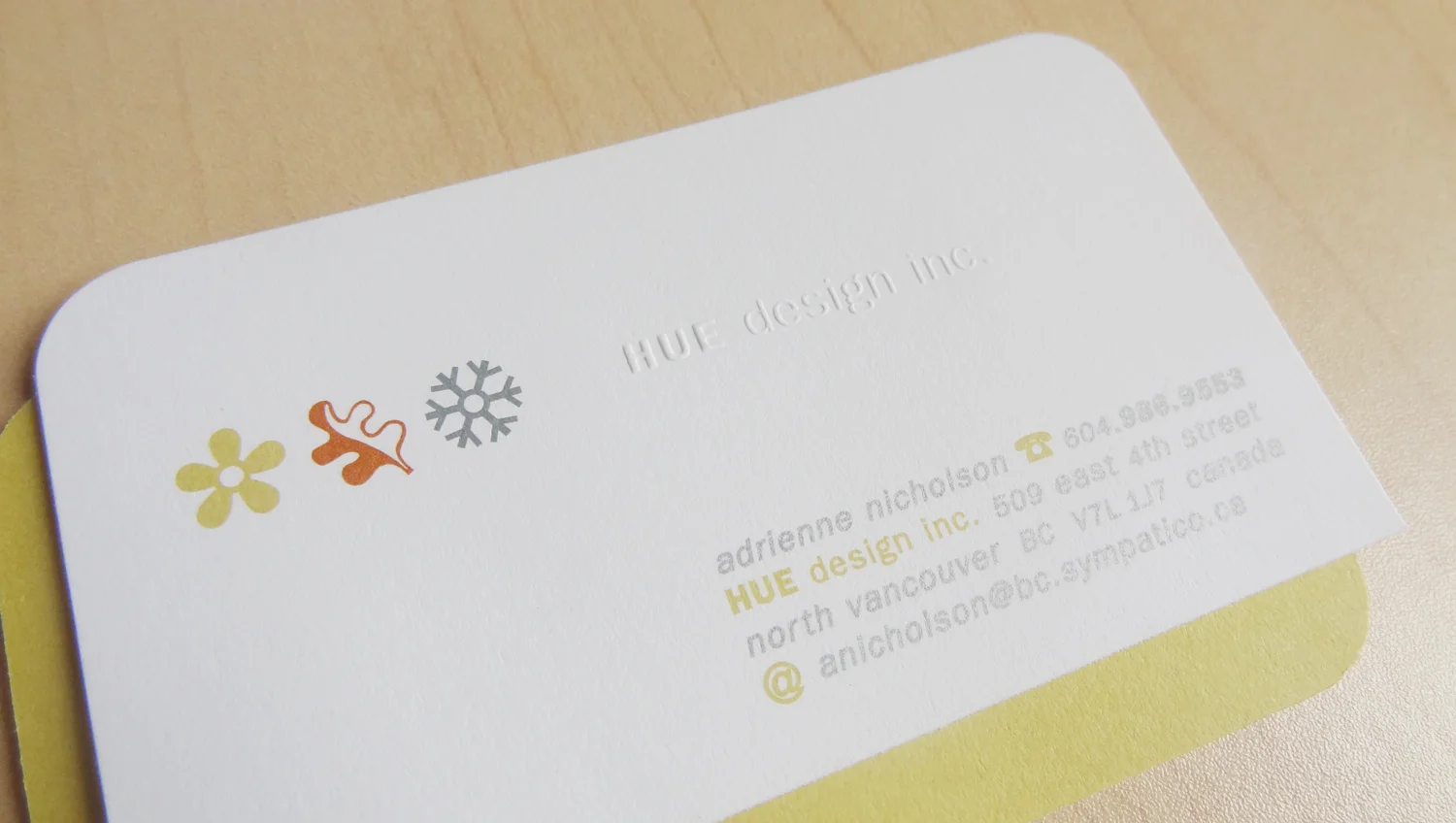
The graphic id created for HUE Design served me well for about 17 years. I still enjoy applying its elements to my communications. I continue to use the HUE palette with its leaf, flower and snowflake, but I am refocussing potential clients' attention on my corporate id and branding services. I do this with a work mark and allow my portfolio of client IDs to show what HUE can do with logos and icons.
HUE Design Inc
The name HUE was chosen for its simplicity. Colour and hue affects our emotions and impulses and therefore can be key to the success of a design project or product. I utilized multicolours, icons and textures to create a band that mimics that seen on the edges of offset printing proofs.
With my first business card I wanted to showcase my love for colour and the feel of paper and what offset printing has to offer. It was a great teaching tool, as I was able to show a client what a card could offer through die-cutting, multicolour printing, embossing and the careful choice of stock weight and texture.
I also love to collect old packaging and nastalgia, particularly for their fonts. In the launch year, HUE sent out postcards each season to remind friends and design contacts that HUE Design Inc. was open for business. Two of the postcards sent out in the first year, were fun collages inspired by my collections.
Vélopower Cycling Club
This logo was created for a fitness trainer, who runs an spin class and was a former DJ. Training with power (power meters, specifically) was his mantra and his weekly playlist provided inspiration to the class. The training on the bike focused on building power or watts ('w'). The bars seen in the logo are reminiscent of a stereo's equalizer and the bars above the W give homage to the rainbow jersey from the Tour de France.
This logo concept sprung to mind as I was waking...the subconscious leading my way once again. Concepts and solutions pop into mind at the strangest moments...usually when I am not working on them. This was a happy balance of three elements united to create one logo.
Mulligan Consulting
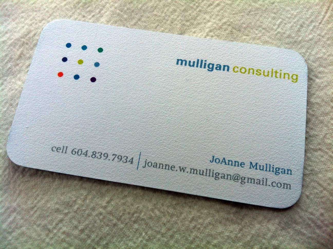
This financial planning consultant was looking for a logo to help demonstrate how this person and their services could find solutions outside of the box for their clients. We felt the colourful dot block was a great visual and texture to use on the materials. The colours for each dot are definitely part of this client's personality, but also representative of all the different clients that they serve.
The 9 dot logic puzzle asks the viewer to connect all nine dots with only four straight line segments without losing contact with the paper while drawing. The solution shows thinking outside of the box.


